Sunday, September 30, 2012

Understanding A Consistent Depth Of Field With Varying Focal Lengths


Copyright Matt Brandon


Matt Brandon of The Digital Trekker did such a great job of explaining how depth of field does not change with focal length (considering aperture stays the same) that I am not going to type it all up again, but instead, link directly to his post.


What Matt says in this post is fairly simple for some, but mind-bendingly difficult for others to conceptualize. We’re all wired differently but I think Matt’s way of explaining the concept works well. Basically he’s pointing out, through a clickable image, how depth of field does not change with varying focal lengths.


The important caveat here is that he kept the subject the same proportions in the field of view. You have seen this in Hollywood films and it is known as the Vertigo or Dolly Zoom effect because the camera is moved closer, or further, from the subject on a dolly to keep proportions the same while changing focal lengths. Such as shown here:


This can further be verified by playing with a depth of field calculator such as DOF Master.


If I go to the site and put in Canon 7D, 20mm lens, f/8 and a subject distance of 3′, I get a total depth of field of 2.31′.


If I change my focal length to 30mm, my depth of field shrinks to .92′. It also means the subject has become larger in the frame, filling more of it.


So if I want the subject to remain the same size in the frame, I need to physically move back. In testing, I can find that I now need to be 4.65′ away from the subject to give the same proportion in the frame. This also gives me a depth of field of 2.31′.


If you don’t believe me, take a look at Matt’s post and then try it yourself. One of the aspects of photography that I love the most is the ability to test and confirm things. There is no black magic in photography, it’s just all light and physics. And art, it’s art too.


Post originally from: Digital Photography Tips.

Check out our more Photography Tips at Photography Tips for Beginners, Portrait Photography Tips and Wedding Photography Tips.


Understanding A Consistent Depth Of Field With Varying Focal Lengths


40 Old Collection of Black and White Photography

Weekly Logo Design Inspiration #01


Today we start a series of weekly logo design inspiration, in this series we present a assortment of a creative and beautiful logo design for your inspiration. We will be glad if you like it and if it have a beneficial impact on your inspiration and creativeness.


We will be glad if you like it and make comment in this article.


Veriation


MCFON


Samarras


Guanacos


See Complete Collection At downgraf.com

Wednesday, September 26, 2012

Bad Videogame Characters


Bad videogame characters manipulated into real life by unknown artist.


More bad videogame characters manipulated into real life here.


Tuesday, September 25, 2012

New York Photography from the early 1920ies


Some vintage photography of New York in the early 20th century.


Read more


How To Create Beautiful Duotone Images In Photoshop

How To Create Beautiful Duotone Images In Photoshop


Black and white photography is classic. And toning and tinting the black and white images; sometimes for archival and other times for creative effects has been there right from traditional times. Just like Sepia, duotone has also gained a firm ground for itself among the classic photographers. But that’s not it. The twist to the story is that these effects add drama and new story to the images.


This is what I realized when took up to split toning for the first time. And after trying duotone, I was again amazed by the results. So I thought to share bits of knowledge and how to about Duotone here.


Duotone is quite similar to black and white. It is a picture in two tones or colors. Thus, it has two distinct tones other than the usual blacks and whites. It can have blue and black, blue and orange, and so on. Earlier blue, yellow, brown and red were used in duotones.


However this effect cannot be achieved in-camera. It needs some darkroom techniques to accomplish the task. Duotone images are yielded by adding one or two colors to the black and white images. So we will have to start with converting colored image to black & white. You can try one of these techniques to convert your images to black & white and then you can go about toning the images to achieve the duotone effect. So, without wasting much time, let’s get to steps for creating beautiful duotone images in Photoshop.


How To: Converting An Image To Duotone In Adobe Photoshop


Here is the step by step guide to create duotone images in Photoshop:


  1. Open the image in Photoshop and go to Image > Mode > Grayscale. Make sure 8-bit/Channel is checked.

    How To Create Beautiful Duotone Images In Photoshop


  2. Go to Image > Mode > Duotone.

    How To Create Beautiful Duotone Images In Photoshop


  3. This will open up Duotone Options dialog box, where you will be making the choice of tones to transform your image. So make sure you select Preview to view the changes with each selection of tones.
  4. In the Duotone Options window, select Duotone from the Type drop-down (as shown below).

    How To Create Beautiful Duotone Images In Photoshop


  5. By default, the first color may be black. You can change it to whatever you like; you can go in for one of the primaries R, G, B or any custom color. Click on the black box and pick the color from the ink color dialog.

    How To Create Beautiful Duotone Images In Photoshop


  6. Next, you need to choose the second tone. Click on the colored box next to Ink 2 to select the colors from Color Libraries. Select an ink from Book dropdown.

    How To Create Beautiful Duotone Images In Photoshop


    [Note: To create highly saturated colors, select darkest inks at the top and lightest at the bottom].
  7. Once you are satisfied with the tones, click on the Curve box located to the left of the colorbox in the Duotone options window itself. Adjust the duotone curve for each ink color to alter the way color is distributed in highlight and shadows. Set overprint colors, if required.

    How To Create Beautiful Duotone Images In Photoshop


  8. Click OK to see the final image - a beautiful duotone image.

Here is the before and after effect of duotoning.


Before: This is a grayscale image you can start with.


How To Create Beautiful Duotone Images In Photoshop


After: This is the final effect that is achieved through duotone.


How To Create Beautiful Duotone Images In Photoshop


How about trying it out? Choose one of your images, fire up Photoshop and delve yourself into this unusual style of coloring the images in two tones.


Jessica Fortner Illustration


A selection of recent editorial and advertisement illustration by Jessica Fortner.


Visit Jessica Fortner


Monday, September 24, 2012

photograph


Phone Booths in São Paulo


One hundred artists were given an opportunity to uniquely redesign 100 phone booths in S o Paulo. The result is beyond all expectations. One hundred completely useless or just vandalized booths were transformed into incredible works of art. Enjoy ;)


More here


Saturday, September 22, 2012

More than a Vignette: The Simple Secrets of Dodging and Burning


A Guest Post by Alex Smith


On the wonderful journey through the world of photography many of us have points where we stop to smell the roses for a bit. Maybe we change from shooting landscapes to portraits or delve into the miraculous details of the macro world. Either way, after a shoot we are inevitably left with some post-processing finesse to add to our images.


If you are like me, you can never learn too many techniques to give your images some spark or flair hoping that the final result captures the viewer's attention, making them stop for that split second to admire the magnificence of your capture. So lets add a gourmet recipe to your photography cookbook and give you a simple, elegant way to add that extra special spice to your photos.


As you peruse the photo collections of your peers you will find that many photographers use vignettes that darken the corners or edges of their images while leaving the central area of the photo lighter.


Why do they use this technique? It is likely that most of you already know that as you look at a photo, the eye is naturally drawn to lighter areas of the photo and away form darker areas. In the days of the darkroom, negatives were dodged (lightened) and burned (darkened) for this same purpose. Thus, the vignette is one of the simplest ways to guide the viewer's eye toward your central subject.


Let's delve into this idea with a little more depth. If we are using vignettes to focus the eye of our viewer and we can all agree that the viewer is the one responsible for deeming whether our artistic endeavor is view worthy, then this business of lightening and darkening in an image is pretty powerful stuff. So why not use this lightening and darkening in a pre-meditated way to take the eye on a narrated, guided tour of our image?


Think about that statement for a second. It's like having parallel park assist on a new vehicle. We can control where we want the viewer's eye to park.


dodging-burning-secrets-1.jpg


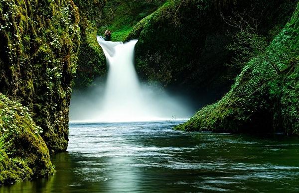
Let's start with seeing the simple and subtle use of this technique in an image I took while on a trip with a good friend to Portland, Oregon. This is Punchbowl Falls, one of the many gorgeous waterfalls in the Portland area. When you look at this photo, the lightness of the water automatically draws you into the majestic waterfall roaring down into the creek where the rippling torrents slowly meander out towards the bottom of the frame.


As you look further, you see the lush, green vegetation surrounding the scene in an explosion of growth, however, then the eye goes right back to that waterfall. The only thing you don't see is me, standing barefoot, and ankle deep in the middle of the creek, balancing on a few rocks praying that I can get the shot before the hypothermia sets in. Now, let me show you an overlay of how I used this lightening and darkening technique in a subtle yet calculated way to get you to drawn into the scene and experience the full gravity of it.


dodging-burning-secrets-2.jpg


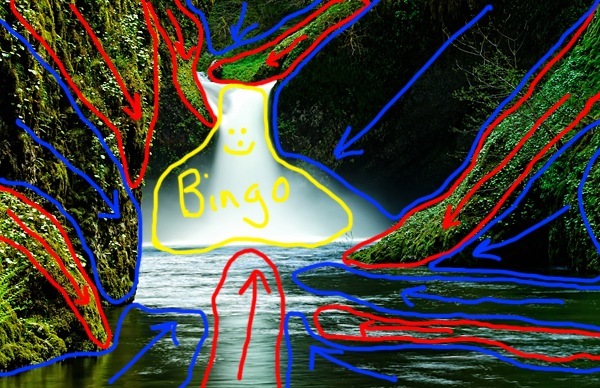
Bingo! I have selectively lightened the areas outlined in red and darkened the areas outlined in blue and all of those leading lines guide your eye right back to the middle of the photo. The key is that it is not totally obvious that this is happening when you look at the original. It is a subtle yet wonderfully effective method to help further enhance the visual impact of your photo. Now let's get to the meat and potatoes of how this is done.


There are several ways to lighten and darken areas of an image and really any technique you prefer can work, but I like to do this in Photoshop just cause that is where I am comfortable working. Once my image is open I hold down the Alt/Option key (PC/Mac) and click on the new layer icon to bring up a new layer dialogue box. In the Dial ogue box I change the blend mode to soft light and check the box to fill the layer with 50% Gray.


dodging-burning-secrets-3.jpg


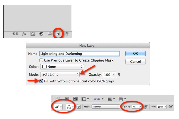
What this does is give me a layer on which everything that I paint that is darker than 50% gray gets darker and anything I paint lighter than 50% gray gets lighter. I then get a soft edge brush set to an opacity of anywhere between 4-8%. I like to keep opacity low so I can just lightly layer in the effect with each brush stroke with a lot of control as to how much I am adding.


Next, I paint anywhere I want darker in black and anywhere I want lighter in white. Remember the key is to keep in mind how you want the image to be visualized by the viewer and plan your brush strokes accordingly. I do many separate brush strokes in each area until I start seeing the effect set-in.


Now, I know some die hard Photoshop enthusiasts are saying why not do separate layers for the dark and light areas so each is independent of the other? That certainly could be done, but I try to keep my number of layers to a minimum so I don't bog down my system and I find that if I have gone too dark somewhere then I just paint over it again with white to lighten it and vice versa.


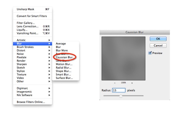
If you over do it a bit, you can always decrease the opacity of the layer itself. Now for that little extra something just to make it all transition smoothly. I like to go to Filter->Blur->Gaussian blur and add about anywhere from a 10-30 pixel radius of Gaussian blur to the effect to get a smoother and more subtle look.


dodging-burning-secrets-4.jpg


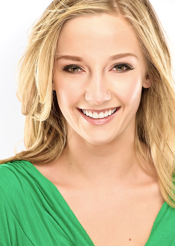
This is my secret sauce so to speak and I find it does wonders especially when applying this effect to portraits. Portraits? Did he just say portraits? You bet! I apply this same effect to highlight cheekbones, brow lines, accentuate hair highlights, etc...


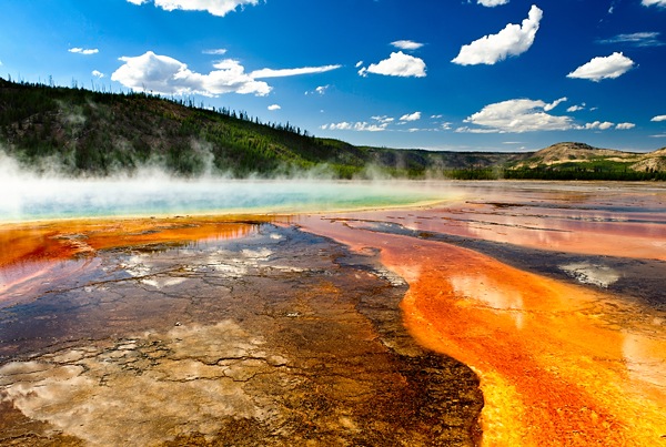
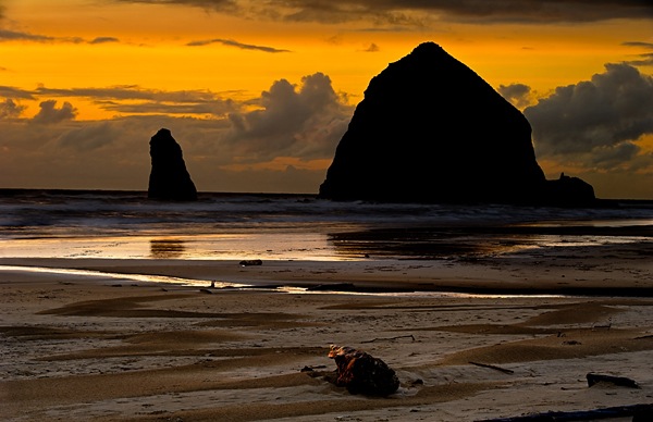
Usually with portraits I find that my end step Gaussian blur pixel radius is a lot higher than for landscapes and often keep it set at 30. Here are a couple more images where I have successfully used this technique in different ways.


dodging-burning-secrets-5.jpg


dodging-burning-secrets-6.jpg


dodging-burning-secrets-7.jpg


So now you are equipped with yet another pearl in your post-processing repertoire. I just hope you remember that it is not just a technique, but it is a guided visual tour through your photo. Use it to enhance drama, create mood, or simply just to de-emphasize some of those more distracting elements in your photo. Now, get out there and give it a try. Your viewers have bought their tickets and are waiting for you to guide their way!


Alex Smith is a photographer and blogger out of Denver, Colorado. His blog Shutterhogs.com is dedicated towards making better photography easier for everyone. More of his work can be viewed at alexsmith88.500px.com.


Post originally from: Digital Photography Tips.

Check out our more Photography Tips at Photography Tips for Beginners, Portrait Photography Tips and Wedding Photography Tips.


More than a Vignette: The Simple Secrets of Dodging and Burning


Dan Matutina


Versus/Hearts is a project created by illustrations Twistedfork aka Dan Matutina . It showcases various rivals from the world of video games or movies, as a double heart. “The rivals hate each other, but deep down they know they could not exist without the other.” Discover.


More picture here.
Join us on Facebook or Twitter