A Guest Post by Alex Smith
On the wonderful journey through the world of photography many of us have points where we stop to smell the roses for a bit. Maybe we change from shooting landscapes to portraits or delve into the miraculous details of the macro world. Either way, after a shoot we are inevitably left with some post-processing finesse to add to our images.
If you are like me, you can never learn too many techniques to give your images some spark or flair hoping that the final result captures the viewer's attention, making them stop for that split second to admire the magnificence of your capture. So lets add a gourmet recipe to your photography cookbook and give you a simple, elegant way to add that extra special spice to your photos.
As you peruse the photo collections of your peers you will find that many photographers use vignettes that darken the corners or edges of their images while leaving the central area of the photo lighter.
Why do they use this technique? It is likely that most of you already know that as you look at a photo, the eye is naturally drawn to lighter areas of the photo and away form darker areas. In the days of the darkroom, negatives were dodged (lightened) and burned (darkened) for this same purpose. Thus, the vignette is one of the simplest ways to guide the viewer's eye toward your central subject.
Let's delve into this idea with a little more depth. If we are using vignettes to focus the eye of our viewer and we can all agree that the viewer is the one responsible for deeming whether our artistic endeavor is view worthy, then this business of lightening and darkening in an image is pretty powerful stuff. So why not use this lightening and darkening in a pre-meditated way to take the eye on a narrated, guided tour of our image?
Think about that statement for a second. It's like having parallel park assist on a new vehicle. We can control where we want the viewer's eye to park.
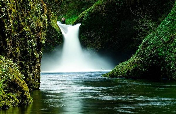
Let's start with seeing the simple and subtle use of this technique in an image I took while on a trip with a good friend to Portland, Oregon. This is Punchbowl Falls, one of the many gorgeous waterfalls in the Portland area. When you look at this photo, the lightness of the water automatically draws you into the majestic waterfall roaring down into the creek where the rippling torrents slowly meander out towards the bottom of the frame.
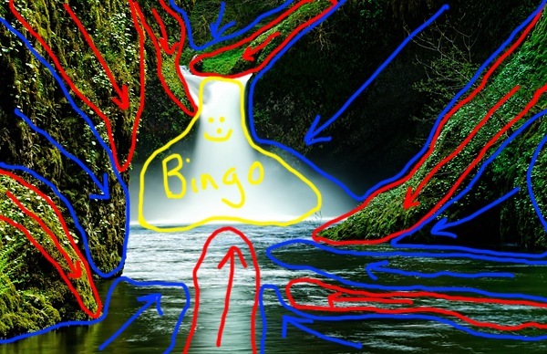
As you look further, you see the lush, green vegetation surrounding the scene in an explosion of growth, however, then the eye goes right back to that waterfall. The only thing you don't see is me, standing barefoot, and ankle deep in the middle of the creek, balancing on a few rocks praying that I can get the shot before the hypothermia sets in. Now, let me show you an overlay of how I used this lightening and darkening technique in a subtle yet calculated way to get you to drawn into the scene and experience the full gravity of it.
Bingo! I have selectively lightened the areas outlined in red and darkened the areas outlined in blue and all of those leading lines guide your eye right back to the middle of the photo. The key is that it is not totally obvious that this is happening when you look at the original. It is a subtle yet wonderfully effective method to help further enhance the visual impact of your photo. Now let's get to the meat and potatoes of how this is done.
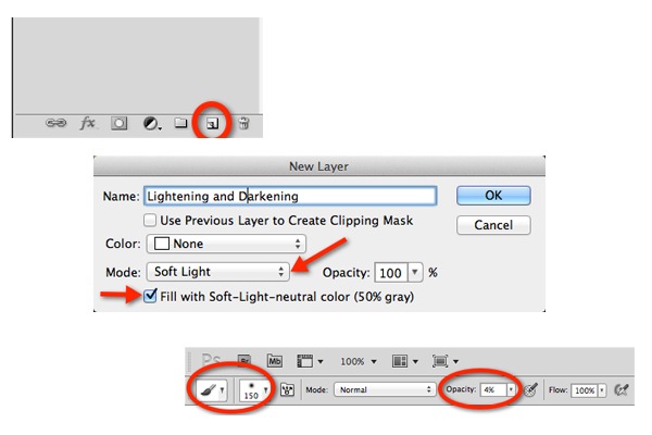
There are several ways to lighten and darken areas of an image and really any technique you prefer can work, but I like to do this in Photoshop just cause that is where I am comfortable working. Once my image is open I hold down the Alt/Option key (PC/Mac) and click on the new layer icon to bring up a new layer dialogue box. In the Dial ogue box I change the blend mode to soft light and check the box to fill the layer with 50% Gray.
What this does is give me a layer on which everything that I paint that is darker than 50% gray gets darker and anything I paint lighter than 50% gray gets lighter. I then get a soft edge brush set to an opacity of anywhere between 4-8%. I like to keep opacity low so I can just lightly layer in the effect with each brush stroke with a lot of control as to how much I am adding.
Next, I paint anywhere I want darker in black and anywhere I want lighter in white. Remember the key is to keep in mind how you want the image to be visualized by the viewer and plan your brush strokes accordingly. I do many separate brush strokes in each area until I start seeing the effect set-in.
Now, I know some die hard Photoshop enthusiasts are saying why not do separate layers for the dark and light areas so each is independent of the other? That certainly could be done, but I try to keep my number of layers to a minimum so I don't bog down my system and I find that if I have gone too dark somewhere then I just paint over it again with white to lighten it and vice versa.
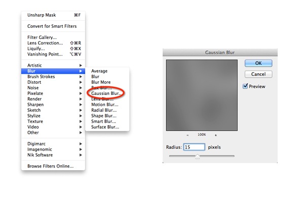
If you over do it a bit, you can always decrease the opacity of the layer itself. Now for that little extra something just to make it all transition smoothly. I like to go to Filter->Blur->Gaussian blur and add about anywhere from a 10-30 pixel radius of Gaussian blur to the effect to get a smoother and more subtle look.
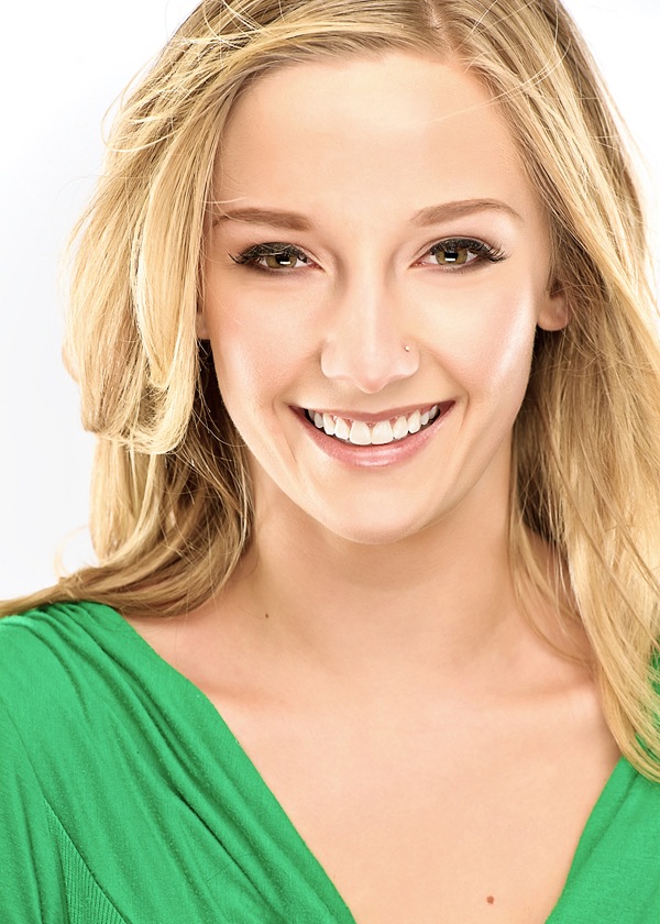
This is my secret sauce so to speak and I find it does wonders especially when applying this effect to portraits. Portraits? Did he just say portraits? You bet! I apply this same effect to highlight cheekbones, brow lines, accentuate hair highlights, etc...
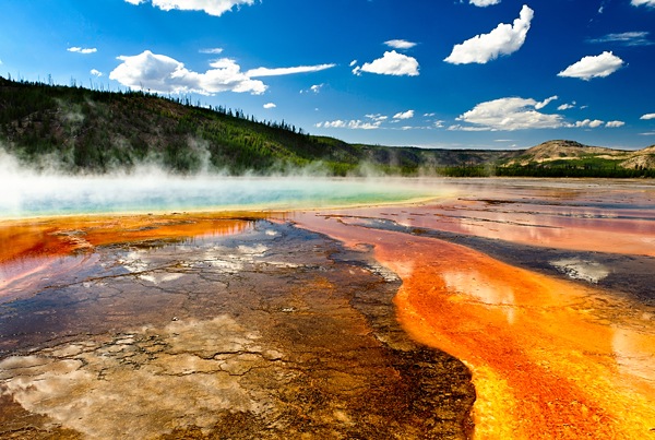
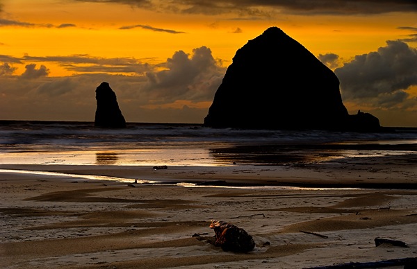
Usually with portraits I find that my end step Gaussian blur pixel radius is a lot higher than for landscapes and often keep it set at 30. Here are a couple more images where I have successfully used this technique in different ways.
So now you are equipped with yet another pearl in your post-processing repertoire. I just hope you remember that it is not just a technique, but it is a guided visual tour through your photo. Use it to enhance drama, create mood, or simply just to de-emphasize some of those more distracting elements in your photo. Now, get out there and give it a try. Your viewers have bought their tickets and are waiting for you to guide their way!
Alex Smith is a photographer and blogger out of Denver, Colorado. His blog Shutterhogs.com is dedicated towards making better photography easier for everyone. More of his work can be viewed at alexsmith88.500px.com.
Post originally from: Digital Photography Tips.
Check out our more Photography Tips at Photography Tips for Beginners, Portrait Photography Tips and Wedding Photography Tips.
More than a Vignette: The Simple Secrets of Dodging and Burning
No comments:
Post a Comment